
Whether you consciously realize it or not, color is a powerful way to associate ideas or products with certain emotions. The Journal of the Academy of Marketing Science found that colors influence brand personality, familiarity, and most importantly, desirability. Color is never arbitrary. Deep scarlet, mellow yellow, or striking tangerine each have the power to alter the general perception of your presentation. Of course the colors and branding for presentations matter just the same.
Here are four simple color tactics for creating clear, influential presentations that help get your message heard:
1. Consider How You Want Color to Enhance Your Message
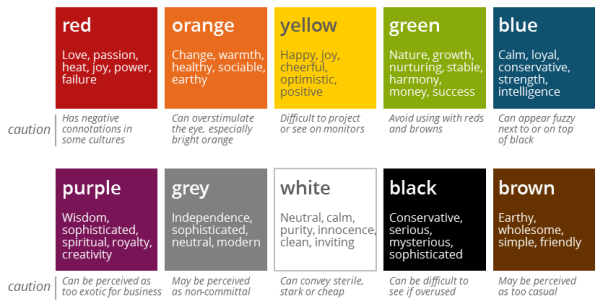
When it comes to presenting, colors can seriously affect how people feel about your message. This has dramatic implications for visual communications. When creating visuals for a presentation, consider how the colors you choose will affect the audience’s emotions: will they complement your message or detract from it? Fiery, passionate, red is a commanding, “hot” color. But is that the message you want to convey? Would cool, loyal, conservative blue—the choice of many financial institutions—be a better choice for you? Orange might seem eye-catching and friendly, but it can also be overstimulating. White might seem clean and inviting, but is it conveying your true personality?
The chart below will guide you in understanding the emotions your color choices will evoke—and when to avoid them.
2. Let the Color Wheel Guide You
One of the greatest tricks of design is color contrast. Beyond establishing mood, this approach uses color to direct attention to your key message.
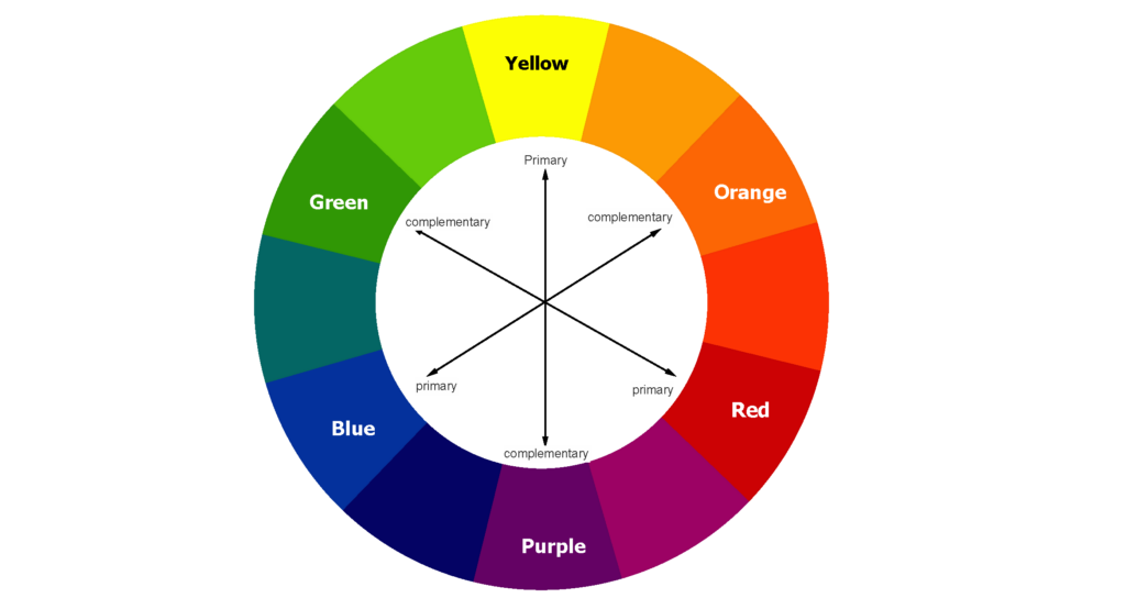
Colors that are next to each other on the wheel, such as red and orange, typically make poor color match because their contrast is similar (in both hue and value), which can make it difficult to see—especially if your slides are being projected. Better color combinations are usually found using colors that are opposite on the color wheel, such as blue and orange. Black works well with light colors, and white coordinates with darker colors. For example, yellow and black are a good match because they are different in the contrast of both hue and value.
The chart below shows blue and orange contrasting in a very simple way. The colors immediately draw the idea to capture the chart’s key message.

3. Subdue…then POP!
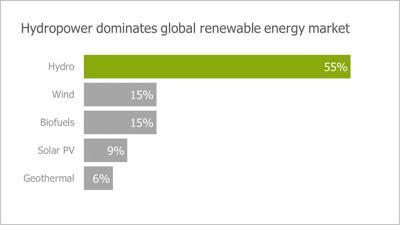
Sometimes, you don’t have to choose complementary color wheel colors. One of our favorite tricks to making your key data pop is to keep all data gray except for one pop of color that draws emphasis to your key message. See below.
4. Always be Consistent with Your Corporate Palette
There is no question that the techniques above will help you convey non-verbal ideas and incite emotion. But if you’re building a presentation on the job, it’s critical to always start with the colors found in your company’s brand guidelines. Not only will this keep your branding team happy, but it will guarantee visual consistency across all materials and ensure your presentation looks professional and on-brand.

Color helps your message is understood at-a-glance
The important concept at work here is that it is critical to focus your audience’s attention. Using color to highlight your key insights helps ensure that your audience will be able to quickly and accurately grasp the meaning. This is ultimately the best way to use color to maximize the influence of your ideas.
Our Influencing with Visuals workshop goes well beyond use of color, teaching you how to organize your ideas into clear, memorable, persuasive visual messages. Contact us to learn more about training your team to design effective visual presentations.