
Bar charts. Line charts. Pie charts. We long to nestle our data in these colorful displays in hopes of breathing great meaning into our numbers. But too often, bad chart choices and misuse of our own data, actually reduce the meaning of our message. Charts should pass a basic test: do they elevate your main point? Do they bolster your pitch or your argument? Do they easily spell out the conclusion you want to communicate? Here are 5 Commandments for presenting data in PowerPoint:
Commandment #1: Thou shalt not supply extraneous data
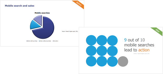
Be scrupulous. Be selective. Only use data that directly supplies information to the concluding point of your argument or pitch. Don’t succumb to pressure to use excess data just because it is available. It will overload, distort, or confuse your message. The pie chart on the left has a lot of information about using mobile phones to make a purchase, but it is confusing and doesn’t even make a point. The chart on the right (which is not ACTUALLY a chart, more on this later) shows just the relevant data, summarizing ONE compelling point.
Commandment #2 Thou shalt not use a chart if you don’t need one
You know when you ask your mother someone a simple yes or no, black or white, in or out question and you get a whole, long story that doesn’t really give you an answer? Frustrating, right? This is the same problem presenters run into when they showcase too much data. Your customer/boss/staff are much more likely to absorb and come to a decision based on one simple, conclusive data point. Is it increasing or decreasing? Is it a significant trend or not? Is this something I should pay attention to and why? Visually display your message but not necessarily in a traditional bar/pie/line chart. Clean lines and a few simple shapes are often all you need to tell the story. The above right graphic is a striking example.
Commandment #3 Thou shalt get to your conclusion quickly
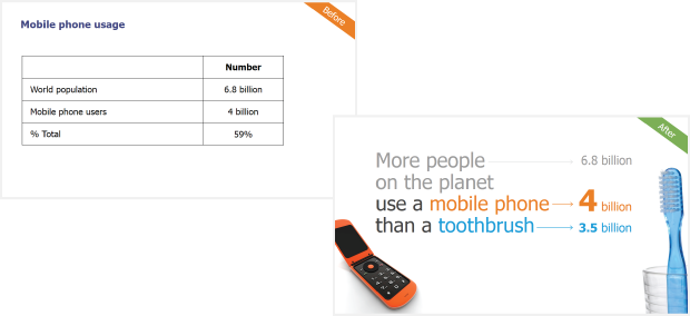
Actually, let’s go even further. When presenting your data on a slide, you shouldn’t just get to your conclusion quickly, you should LEAD with your conclusion. In the below left slide, the point of the table about mobile phone usage is not really specified. Are we to conclude that 59% is a lot of users? Not enough users? What is the impact? The slide on the right not only puts mobile use into vivid context, it get straight to the significance of the message.
Commandment #4: Thou shalt illustrate your data with a meaningful photo
OK. This is not exactly a commandment. But photos with great context can really visualize and help drive home your message. This is especially true if you are presenting data about people. Photos of people (or silhouettes) will instantly humanize your data. One word of caution: use photos sparingly and never cram too many in one slide. The below slides use photos to effectively illustrate their story.

Commandment #5: Charts shalt not be used in the following circumstances:
- Your data is extremely dispersed, such as very high and very low values. For example: If you have a range of salaries and the CEO’s salary is $500K and everyone else’s salary is $50-75K. A chart will be so distorted that it will be distracting to the message.
- Your data is very homogenous, with extremely similar values. For example: All calls in a call center are answered within the first 3 seconds, so the variance of response times is not great enough to graph. The differences are not meaningful.
- When you have large amounts of data. In this situation, it’s usually best to present your audience with a summary. For example: Click-through rates for an advertising campaign.
- When you have sparse data. For example: Rainfall in the desert. Why would you want to graph the one day it rains?
Looking for data visualization training for your team? TPC’s Presenting Data Visually workshop will arm you with the tools and techniques to make your data story shine.