Are you a data nerd? Do you love ‘mining the numbers’ for deeper meaning and trends? Then you’re in the right place. The amount of data that companies need to process and analyze in order to gain market insights is only growing – and quickly. The bad news is that you need to be presenting important data in a way that non-Excel loving executives and managers can actually use — and you probably aren’t doing that as well as you could.
Here to give you some tips on how make your data ‘at-a-glance’ meaningful to your boss, your team, or your customers is Janine Kurnoff, co-founder of The Presentation Company. Kurnoff’s entire job is to do just that: make data presentation do its job. By following her four tips, you can make any presentation clearer. It all starts with story.
Step 1: Determine Your Story
“You’ve analyzed your data and identified your insights, great. But it isn’t time yet to break out bar charts or scatter plots,” Kurnoff counsels. “You have to stop and ask yourself: ‘What exactly am I trying to achieve here, and why?’ This is an absolutely critical starting point for any coherent focused data story. You can’t show your audience everything, so consider carefully what you want attendees to learn from and more importantly, do with your findings.” In other words, bulk data presented just for its own sake rapidly loses value. “Although the numbers contain critical evidence to support your story, the numbers on their own don’t make up the whole story,” Kurnoff stresses.
It is absolutely essential to craft your story first. “Data justifies nearly every business decision we make, yet senior managers don’t have the time or patience to wade through rows of numbers and endless charts,” Kurnoff explains. “And it shouldn’t be up to them to tease out the relevance of your numbers. This is your job. It’s where your value to the organization really shows. To summarize, interpret, and share a true story is to fully maximize the impact of your data.”
Step 2: Write Headlines that Report the News
Kurnoff suggests you try to imagine each slide as a news story. “As we know, every news story needs a headline. Writing headlines forces you to articulate your most important data insights for each data graphic. If you have already determined your story (Step 1), this step shouldn’t be difficult.”
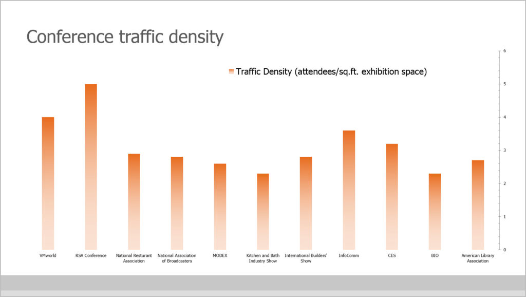
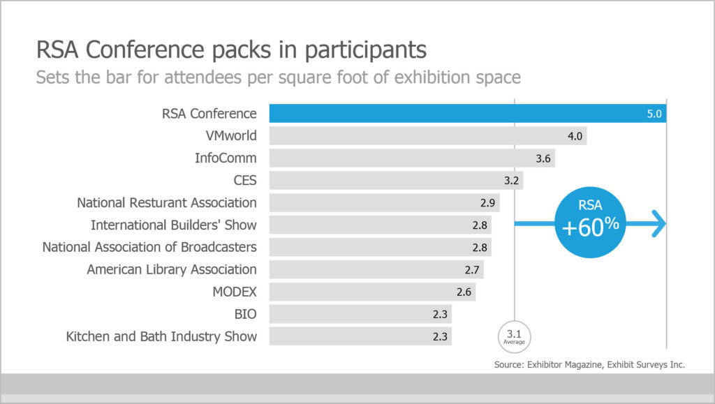
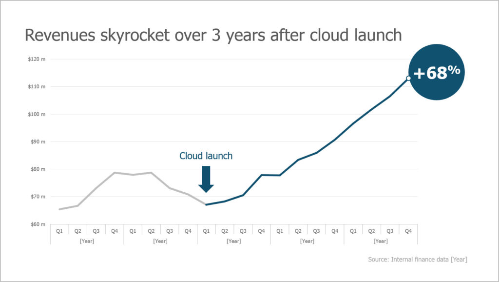
Attention-grabbing headlines emblazoned across every slide will spark curiosity in your audience. “Notice how the slide on the left (below) gives a generic label for the table? Borrrring! It doesn’t say anything about the data other than… this is data. The headline on the right however, tells a story. In a glance you understand who, what, and where this slide is talking about. Notice, too, how specific data points that support the headline are called out in a contrasting color (more on this tactic later).”
She advises, “In addition to carrying your data’s most important piece of information, a great headline should:
- Be compelling and provocative;
- Make a bold statement;
- Use persuasive language;
- Include a benefit, cause and effect, or prediction;
- Avoid unnecessarily words, like ‘a’ and ‘the’.
Step 3: Use callouts to highlight important data
After determining the headline, it’s time to figure out the best way to display your data. “I am not going get into a debate about bar charts vs. pie charts,” Kurnoff jokes, “but I would like to discuss the amazing power of callouts in your charts. Callouts are a marvelous way to let you visually ‘gesture’ to your most important data, thereby drawing attention to it.”
Kurnoff says: “There are three simple techniques to create useful callouts:
- Using color
- Playing with size
- Adding basic shapes
These techniques allow you to create a focal point for the specific metric that supports your story. Note: I suggest never using more than three callouts per chart. Notice the left chart (below) lacks a focal point. The audience is forced to decipher the data story on their own. This is where you are most likely to lose them. On the right, however, the callout (blue circle) highlights the data that is most relevant to the chart’s big story.”
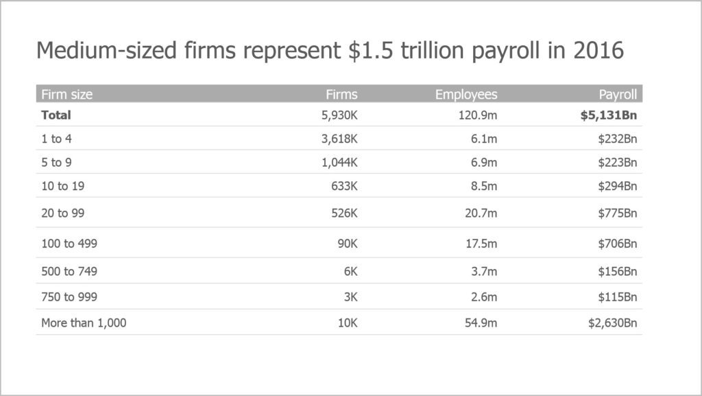
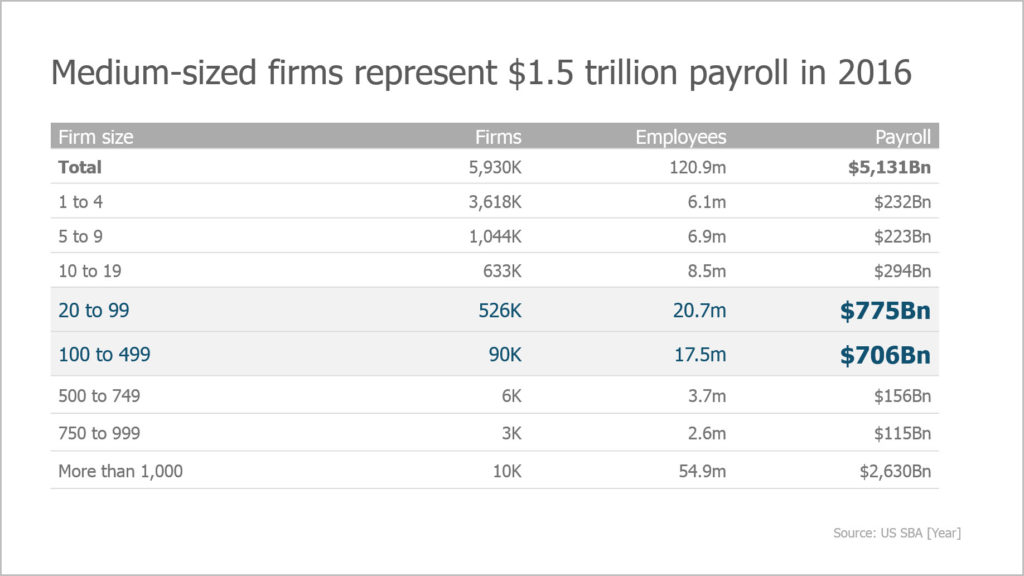
“Below is another example of a plain table with no focal point (left) and therefore, no real story. However, the callouts on the right use both color and size to signal the most relevant information in the table. This kind of highlighting is absolutely key in helping your audience understand — at a glance — what you want them to understand.”
Step 4: Minimize the noise
The opposite of calling out your critical data is figuring out what data to minimize or even delete. “To minimize clutter, start with your labels,” Kurnoff explains. “Are they as informative, accurate, and concise as possible? Is your data easy to read? Does the data presentation convey a clear message? Are axis labels accurate and easy to understand?”
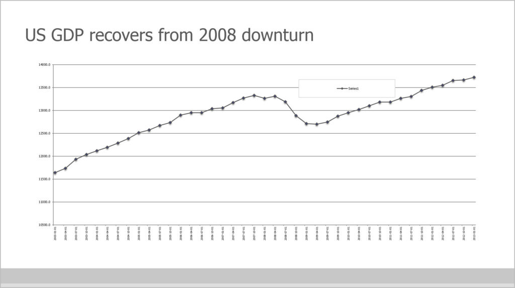
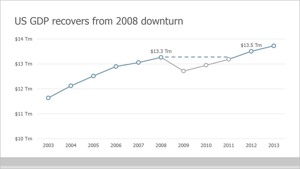
“The chart below on the left is teeming with information and is very difficult to parse. On the right, colors are used to call out important data points. The data has been averaged annually to reduce the number of data points, and also allow the horizontal axis to be minimized. Elsewhere, axis labels are abbreviated to trillions and the vertical axis has been removed,” Kurnoff points out.
“Today’s expectations of data visualization are always about the numbers telling stories. For all those tasked with gathering data, adopting this mindset will help ensure that all your hard work will prove valuable, and lead to real decisions. Anything else is a missed opportunity,” Kurnoff concludes.
Respected data visualization scholar, Stephen Few, notes:
“Numbers have an important story to tell. They rely on you to give them a clear and convincing voice.” By following Kurnoff’s four steps, you can make your data easier to understand, simpler to communicate, and much more useful. The amazing information you have spent so much time and effort teasing out of the mass of data, will be the star of your story.
Interested in learning more data visualization strategies? Check out The Presentation Company’s Presenting Data Visually workshop.
Republished with permission from Forbes.com.