
Chances are, you’re probably emailing your proposals, executive summaries, or strategy reviews much more often than presenting them live. And if you’re worried this hampers many of your great ideas from getting across — you should be.
Why? Because people hate words. Not all words, just too many words. Visuals on the other hand, they love. In fact, visuals are processed remarkably faster than text. So, the more you convey your ideas visually, the less they’ll get lost on your audience – especially when you’re not there to act them out in 3-D. Here are four ways to create a more visual proposal:
1. Like Hansel and Gretel, Use Breadcrumbs
Navigating through a proposal is like going on a road trip. You should have a destination in mind, but plan on making a few stops along the way. First, you need a map. ‘Breadcrumbs’ are a great way to map the journey of your ideas for the ‘travelers’ of your proposal. Like Hansel knew, breadcrumbs will show your audience exactly where they are on the journey. See below examples of a map that includes a visual breadcrumb in each box. 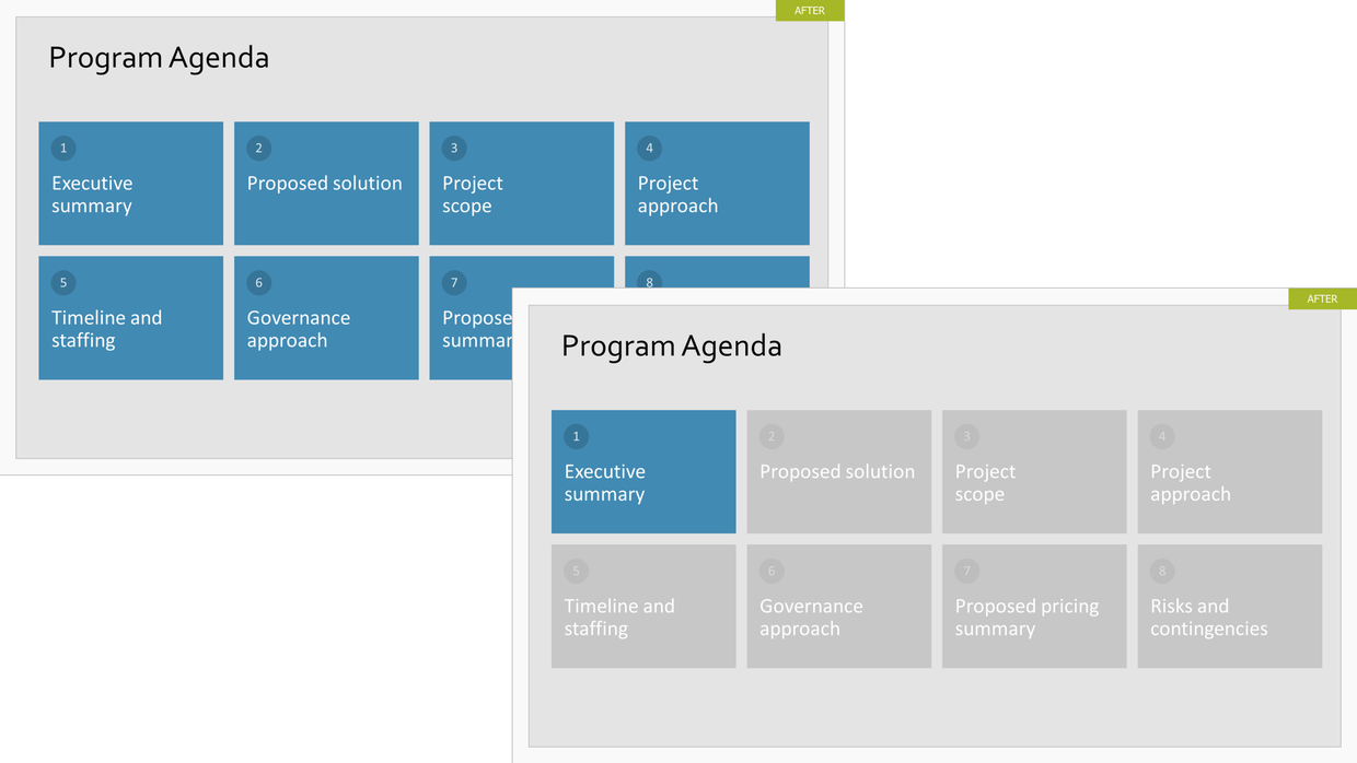
On the left, you can see on the full map of the upcoming journey. On the right is the first stop on the journey – the executive summary. Notice that although the rest of the presentation is grayed out, it’s still visible. The grayed out ‘bread crumbs’ tell the audience where they will be headed next. Breadcrumbs also let your audience carefully control the flow of information based on their own needs. If you hyperlink each breadcrumb box, your audience can instantly jump to wherever they want in the presentation. And they will appreciate it.
2. 60-second Summary. Upfront. Always.
No matter how in depth your support information, there will always be people who make their decision to dig in or delete your presentation on slide 1. Include an executive summary slide every time to get past that first gate. It’s key is to give the critical ‘need to know’ information right upfront.
Below is a great one-glance example of an executive summary made visual. It is particularly helpful to ‘bucketize’ or group it into segments. Also, highlighting each topic name in a different color helps the viewer sum it up even more quickly. Look at the bottom left vs. the bottom right. When we say ‘at-a-glance’, this is what we mean. 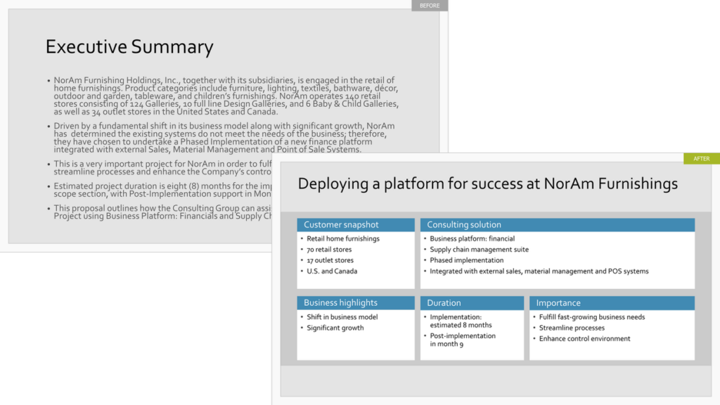 3. Net It Out
What do audiences wish presenters would do? “Don’t make me work so hard to understand your message.” We hear this plea all the time, and our advice goes for those presenting live or emailing a deck. Net out your ideas. This means, you need to elevate your key messages and eliminate the clutter.
It isn’t easy, because you can’t toss every fact, statistic, and product feature into the deck. You must make choices — you must eliminate words. It will help your audience grasp your proposal much easier by elevating fewer points. That being said… there are different degrees of netting out.
The below examples show extreme netting out and moderate netting out. Only you can determine what absolutely must be kept in. But, we believe that strong editing is critical to holding your audience’s attention. See below how distilling key messages and using simple iconography can transform a slide jammed with words and data. See extreme and moderate versions below.
Extreme Netting Out: 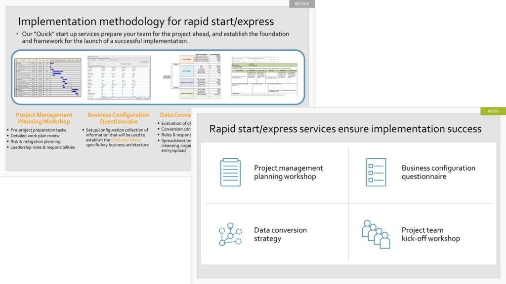 Upper left: Jammed ideas Lower right: Key messages and simple iconography replace words
Moderate Netting Out: 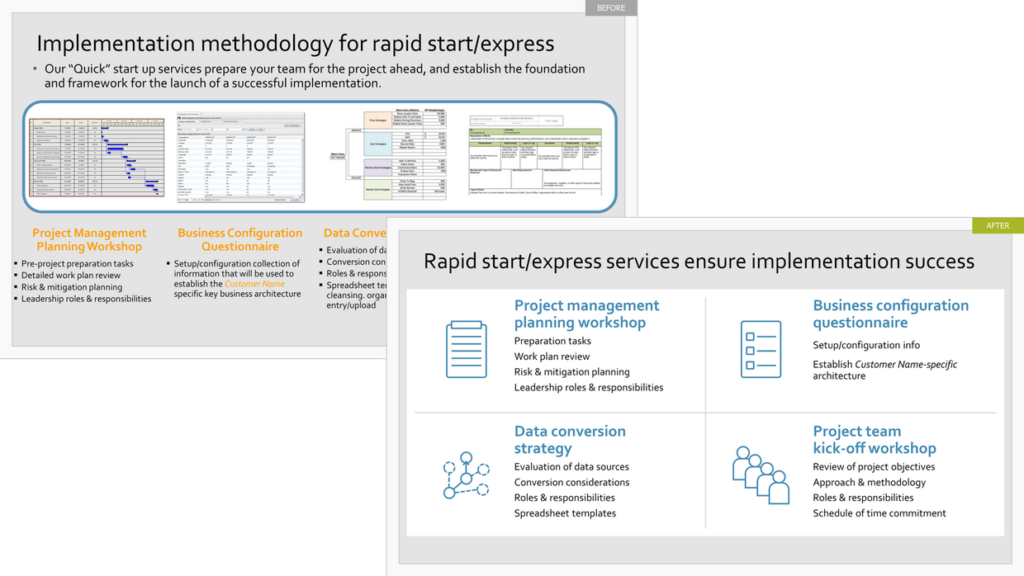 4. A Warning!
When you do email your proposal for people to self-navigate, we suggest you remind them to view it in ‘slideshow’ mode. This will allow for all the hyperlinks (as discussed in point 1 above) and intuitive self-navigation to be active.
Interested in learning more about creating visual presentations? Get in touch with The Presentation Company at 888-991-0208 or see more information about Influencing with Visuals workshop here.