We’re addicted to data. It helps us find golden revenue opportunities. It helps us slash project costs. Whatever path we seek or decision we are trying to make, we rely on data to get there. But sometimes instead of hastening decisions, data can actually hinder them. That’s because those who spend time gathering data have a tendency to want to show off ALL of it. Even data visualization experts – with ability to render beautiful, colorful charts and tables – will struggle to give their data meaning unless they know how to tell a story.
Data without a story lacks impact for two reasons:
- The data isn’t distilled. We don’t necessarily need more data to solve our problems or uncover opportunity, we need to identify and communicate value from the data we already have.
- The data doesn’t support a BIG Idea. Data that is “fire-hosed” makes it difficult for our audience to quickly grasp the actionable “news” it brings.
So how can you combat this data crisis? First, you must distinguish between two important but distinct concepts that are often conflated — storytelling with data and data visualization. Next, check out some powerful techniques that will help you fold your ideas into a data-driven story. Here is a guide to get you started.
What is data visualization?

Data visualization is simply the visual representation of data. This might be basic charts and tables that are generated from a spreadsheet. Or, it could go well beyond those modalities to include any use of shapes, color, and sizing to draw visual focus to data findings. Bottom line, data visualization is about communicating the substance of your metrics in a visual way.
Data visualization can certainly be used to tell a story at the slide level. It can:
- Provide context
- Elevate and draw attention to key insights (and visually subdue the others)
- Lead to action (AKA: the “ask”)
However, the real magic happens when data visualization is driven by storytelling at the slide level and story level.
What is storytelling with data, and why is it important?

Storytelling with data differs from data visualization because it requires communicators to offer a larger, holistic, view of their message. You must focus first on your audience and structure a larger message before any visuals are rendered. You must identify from the start:
- What do I want my audience to know or do with the data I am presenting?
- How will I structure a narrative that leads to desired action?
- How is my data helping drive a decision?
There is no understating how important it is for all presented data to have a purpose. Every piece of data you include should further this purpose – or it should be left out.
How do I get started storytelling with data?
We all know that telling a story with data gives it meaning. But many of us wonder: How do we actually do this? Well, the work begins before you sit down at your computer to build that chart or table. A good data storyteller always begins with their audience and establishes their key message:
- What am I trying to achieve with the data I choose to display?
- Who is my audience? What do they care about? What level of data detail will they likely expect or appreciate?
- What is my BIG Idea — the one thing I want my audience to know or do with my data?
Storytellers also determine: “Is the data I am choosing moving forward the story I want to tell?” If the answer is yes, it is probably safe to include it. At that point, you are ready to open your computer and begin to build your visuals.
I don’t have experience in graphic design or storytelling. Where do I start?
Whether you are using basic data visualization software that will quickly elevate and call out key points or sophisticated tools and apps, remember: the best way to get decision-makers to act is through storytelling. This requires you to develop a basic story structure that drives one, overarching BIG Idea forward. With this structure in place, you’ve got a roadmap to identify which data must be included and which can be obscured or left out entirely.
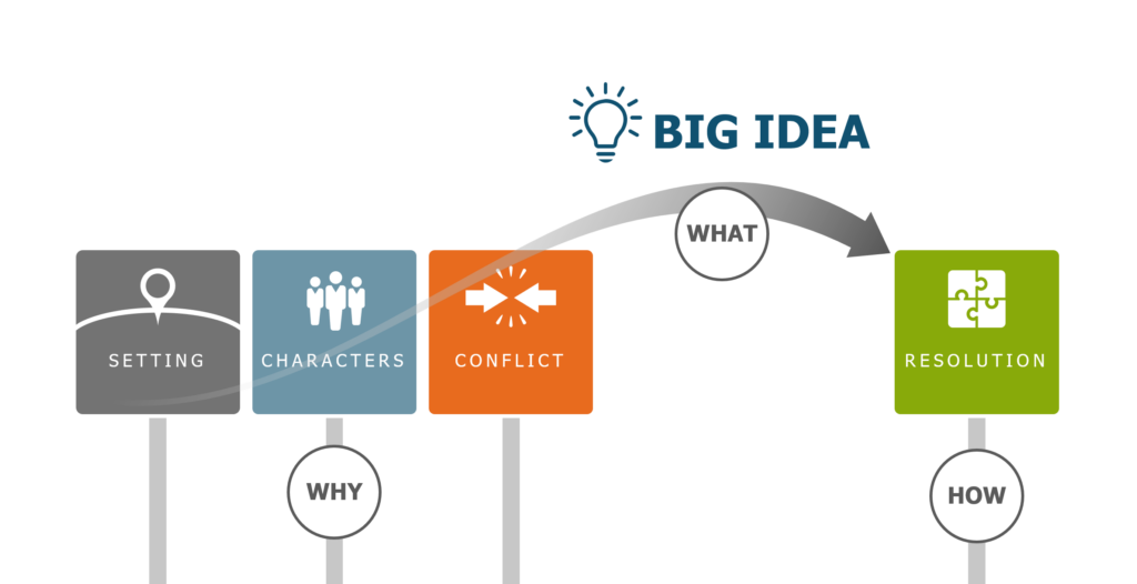
Once you’ve identified clear points to make, visuals should be kept simple and draw only your key points into focus.
What are some simple data storytelling techniques that enhance my message?
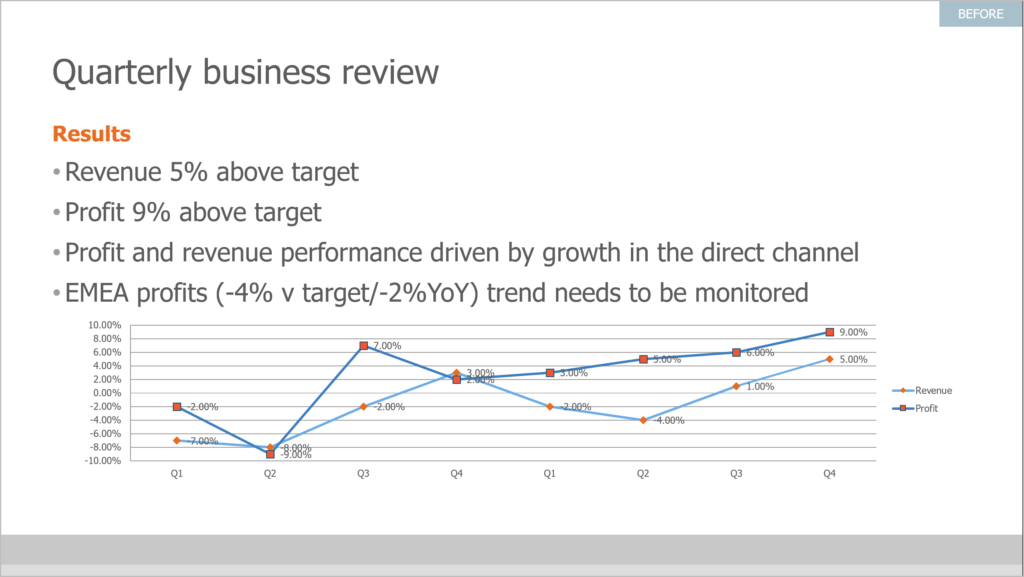
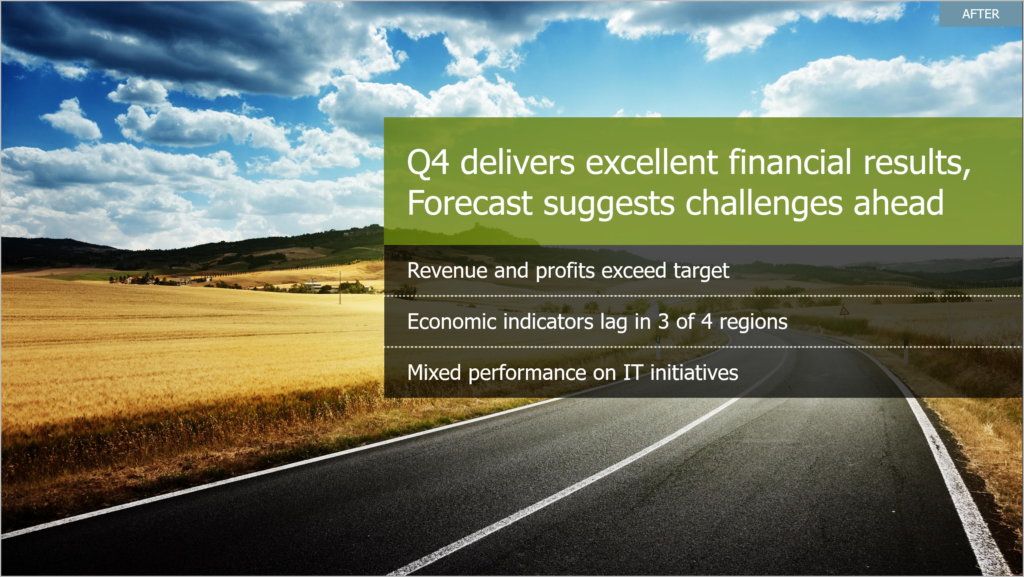
Create a Headline for Every Slide
One of the best visualization techniques is actually all about text. Imagine each slide as a news article. What is the most significant data finding you want to share? Write that headline at the top of your slide. In fact, write a headline on every slide. This powerful practice forces you to visually articulate your key insights and connect your slides in an easily recognizable pattern.

Consider photography
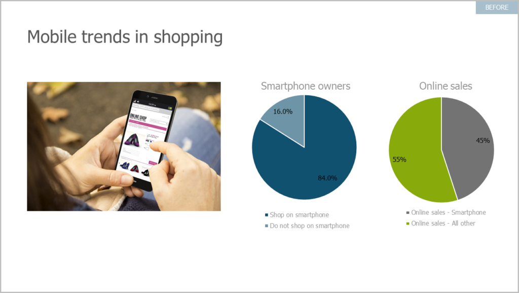
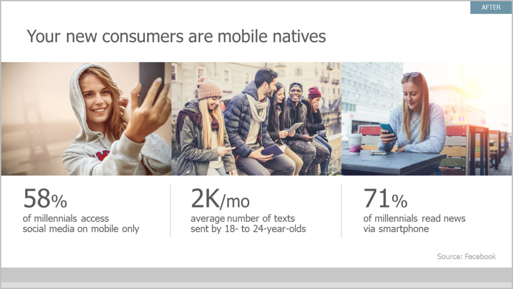
Slapping a spreadsheet or loads of bullets on a slide is the opposite of good data visualization. The information will simply wash over us, causing squints and confusion. A good alternative is to break up text with photography or simple icons. Not only is it more visually pleasing, it is actually proven to help get your story across. Neuroscience tells us, pictures are infinitely more memorable than text.
Don’t supply any extraneous data
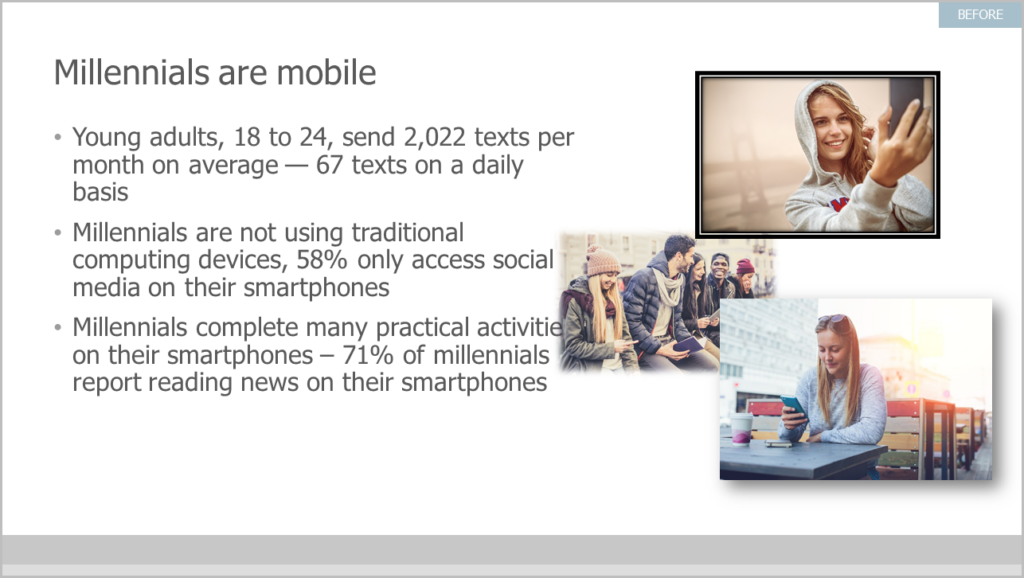
Be scrupulous. Be selective. Only use data that directly supplies information to the concluding point of your argument or pitch.
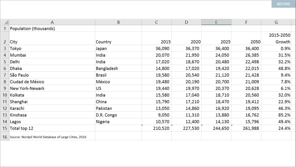
How else can I bring my data story to life visually?
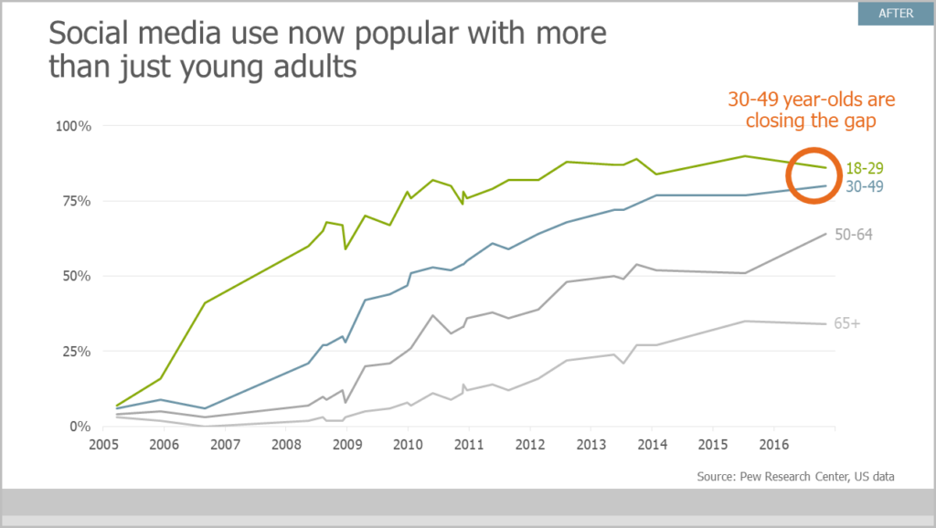
Use call-outs to highlight important data
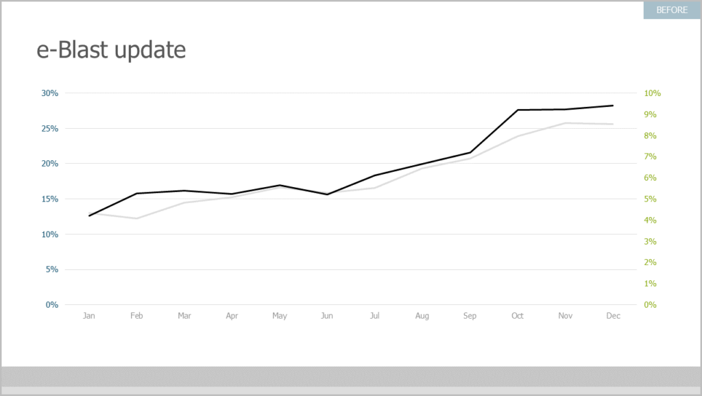
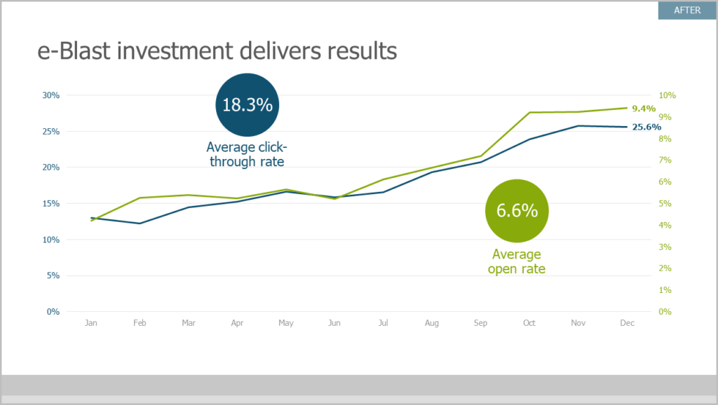
Call-outs allow you to create a focal point for your key metric on your slide. They are created using color, size, and shapes, attracting focus to a specific area on your slide.
Don’t use a chart if you don’t need one
Your audience is much more likely to come to a decision based on one simple, conclusive data point. If you don’t need to visually display your data in a traditional bar/pie/line chart, then don’t. Clean lines, over-sized text, or a few simple shapes are often all you need to visualize the data story.
Minimize the Noise
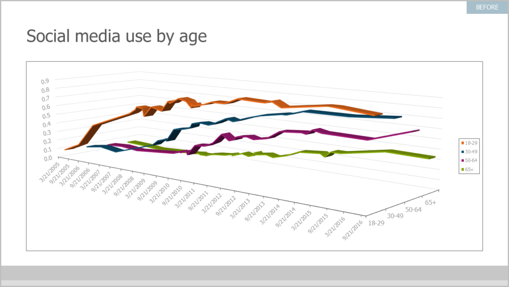
The opposite of calling out your critical data is figuring out what data to minimize or delete. To minimize clutter, start with your axis labels: Are they as informative, accurate, and concise as possible? Is your data easy to read?
Where can I learn more about data visualization techniques?
Check out our resource center for more of our favorite storytelling with data tips. Have an hour to spare? Watch our webinar, Storytelling with Data, for an in-depth look at how some of the same data storytelling strategies have helped impact one of the world’s top brands.
