Ask any executive what their biggest frustrations are and, invariably, they will answer, “long-winded, unfocused presentations that pack in too much data.” Modern institutions – from major manufacturers to governments to financial services – have a real data problem. But the data itself isn’t to blame. After all, charts are not inherently bad or evil. The problem is that well-meaning data gatherers – who offer charts and tables galore – fail to distill their numbers into a clear, digestible, meaningful message.
And, unfortunately for hectic execs, it doesn’t look like our zeal for data display is slowing down anytime soon. On the contrary, smart, hard-working, capable people, who have spent months gathering product performance numbers or quality assurance trends, or financial projections, want to show the dazzling display of “knowledge” more than ever.
But data with no clear message isn’t knowledge…it’s just data. And the truth is, executives aren’t looking for data – or often even generic knowledge – they’re looking for actionable insights. And they don’t want to have to work to get them. They think it’s your job (and it is!).

Learning and development professionals need their ideas to be heard and are often challenged with proving training’s impact to business leaders. By understanding how to display data in a way that is not only visually appealing, but tells a compelling story that engages audiences and drives key messages home, learning leaders are better positioned to demonstrate business value and gain buy-in for their programs.
But before we get to the amazing data visualization techniques, there are two critical steps that should always come first: You must clearly understand your presentation goals, and you must identify the key data points that will support your BIG Idea. With that, you are ready to unleash clever visuals techniques that will trigger lightning bolts of insight within your audience. Here are the three steps:
STEP 1: Understand Your Data Presentation Goals
Most data presenters skip a simple, yet critical, exercise. They don’t ask themselves: What exactly am I trying to achieve with my data presentation? Who is my audience? Am I giving an update or status report? Am I presenting a forecast that will influence future decisions? It’s only when you have truly nailed down your end goal that you can start to tease out the relevance — and the story — behind your numbers.
STEP 2: Highlight Data that Support the Intended Goals
With an established goal in place, you can then select the specific data that will strategically further that goal. Which data should be elevated? Which data should be subdued? Effective data presenters are always picky when choosing which data to display that will further their narrative and drive their key message home.
STEP 3: Make Your Data Visual
Many people don’t understand the difference between pretty slides and true data visualization. Use of color, shapes, and text is never used as just “eye candy”. Data visualization techniques are strategic triggers that draw the eye to a focal point in order to register specific information first with an audience. If you have completed Step 1 and Step 2, you will know exactly which specific data points or trends that you want to visually isolate. There are many kinds of visual elements to choose from – including photos, diagrams, charts/tables, text, and video.
Here are three clever data visualization techniques that will help turn your numbers into narratives:
Data Visualization Technique #1: HEADLINES
One of the easiest ways to highlight key data is through slide headlines. The simple beauty of headlines is that every slide has its key message or takeaway blaring right from the top. What’s even better is that these loud banners are also part of the narrative structure of your entire presentation. Each headline serves to further the story even without the data. It should always culminate with a logical conclusion such as a call to action or a next steps recommendation. No more presenting data just for the sake of it. Every chart and every slide has a point, and more importantly, each display is part of the larger story.
See Figures 1 and 2 for the before and after slides:
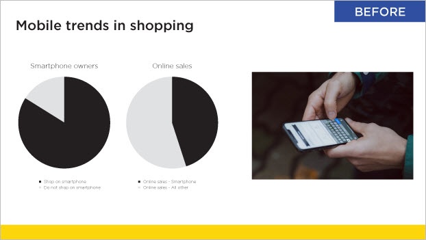
Figure 1

Figure 2
In Figure 1, the headline “Mobile trends in shopping” tells us generally what the slide is about, but it doesn’t advance the story at all. Figure 2 is much more active. In the headline, “Mobile is changing the way people shop and buy” we are left with information that makes us want to know more. How is mobile changing the way we shop and buy? And the data below should of course, support this question.
Visually, the headline in figure 2 is larger, so the eye goes to it immediately. The key data points of the story have been elevated giving the audience a strong, distinct, message. No one has to work hard to figure out why they should care about this data point. Also, this slide replaces the tired pie charts with the more modern ‘donuts’ that are consistent in size and style. Notice how color is introduced more sparingly in Figure 2, but where it does come in, it makes a bigger splash.
Data Visualization Technique #2: CALL OUTS
Today’s data visualization techniques can give us options from plain tables and graphs. But still, sometimes you just need a chart. In addition to creating the active headline that highlights the key takeaway from your data, the best way to draw the eye to your most crucial data is with color, size, and/or shapes that literally calls out key data.
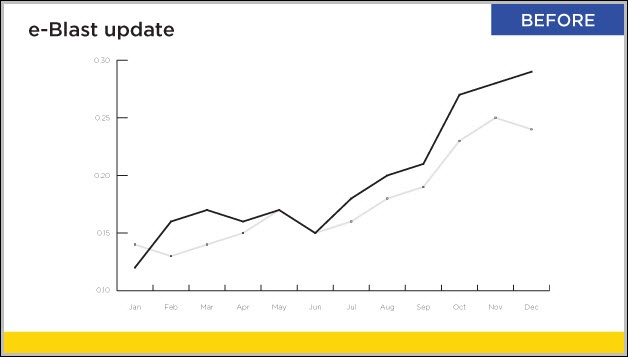
Figure 3
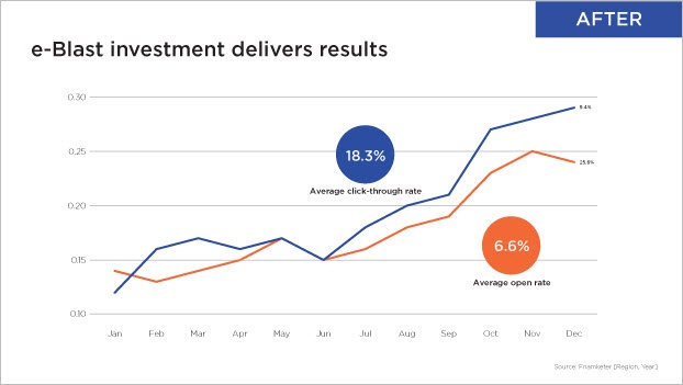
Figure 4
Figure 3 shows a simple line chart that doesn’t supply a definitive message. The audience cannot immediately glean the significance of the data. Figure 4 has a strong, active headline AND uses color, shape (the circles), and size to call out precisely where the data supports the headline. In this case, we see at-a-glance, precisely how much e-Blast is positively influencing click-through rates.
Data Visualization Technique #3: Beating Back the Bullets
In addition to executives rolling their eyes over the amount of data they are presented, they are also overwhelmed with line after line of bullets. For some reason, people have been trained to believe that adding the little dot to the beginning of each line breaks up crowded text and makes it easier to wade through (see Figure 5). Visually, it doesn’t help much at all. Notice below what a difference the over-sized metrics in Figure 6 do to draw the eye to the key data points.
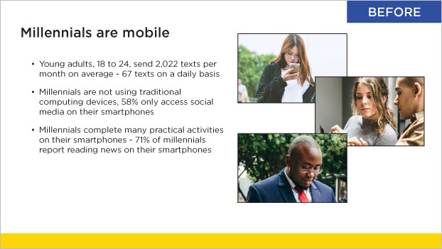
Figure 5
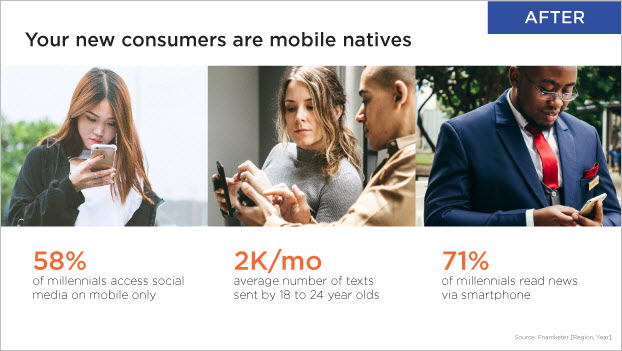
Figure 6
Data isolated in this way truly supports your story because it becomes a visual focal point, rather than buried within the text.
Also, the photos in Figure 6 are much better contextualized with the data. Notice how keeping them uniform in size, style and alignment serves to humanize and enhance the data rather than muddle it. There are many visual elements, such as text, photos, even bullets, that should only be included to highlight key data points, not compete or obscure them.
Data = Decisions
Executives are decision machines looking for cues to what will make their job easier. Unfortunately, they are often frustrated because where they hope to find glaring signals coming from methodically-collected data, they are often left with a lot of noise. And they don’t have the time to slog through extraneous information to get to the insights. Now more than ever, data is critical in measuring ROI and demonstrating the success of training. But the data won’t speak for itself. As training professionals, we must hone our data storytelling skills in order to protect our budgets, secure additional training, win conversations, and ultimately cultivate a culture of continuous learning.

Those of us who show the greatest value to our boss, team, or customer have taken the time to fully understand the goal of our data presentation. From there, we’ve identified the data that specifically furthers our narrative. And finally, we’ve employed strategic data visualization techniques that will take our audience on a journey through valuable insights and thereby, driving important conversations and decisions forward.
Janine Kurnoff is Co-founder and Chief Innovation Officer of The Presentation Company (TPC), a business communications firm specializing in onsite and online corporate presentation training. TPC helps some of the world’s top brands to tell visual stories that powerfully connect with their audience.
Re-published with permission from Training Industry Magazine